Is the number going up, or does it only feel like it because the notifications keep arriving?
That is the real question behind almost every search for follower analytics, and X answers it badly on purpose. Your profile shows one integer with no history attached, so the comparison you want, this week against last week, has to come from somewhere else.
Your follower count on X is a live total, not a record, so it cannot tell you whether the last seven days were a gain or a loss. Circleboom captures that count every day through official X API access and draws it as a growth line plus a daily gain-and-loss bar chart, which turns the question into something you read rather than something you estimate.
→ Twitter follower growth stats (this link takes you to Circleboom, outside Medium)
The harder half is not reading the drop. It is working out whether the drop was yours.
Why the weekly comparison is the one you cannot make on X
X gives you a current follower count and no earlier value to hold it against. There is no built-in view of what the number was last Monday, no weekly delta, and no log of the days in between.
Worse, the two directions arrive through different channels. New followers generate a notification. Unfollows generate nothing at all.
That asymmetry produces a specific and very common error: people conclude they are growing because the arrivals were audible, when the count actually fell.
Circleboom's breakdown of why you keep losing followers on Twitter covers the causes, but the diagnostic problem comes first.
You cannot address a loss you have not confirmed.
A weekly answer needs three things a live count does not have:
- A value recorded on each day, so any two dates can be compared.
- A per-day sign, so a week is more than one subtraction.
- A date stamp on the outliers, so a bad day can be investigated rather than felt.
Circleboom's Twitter follower analysis views sit alongside the growth chart and supply the second half of that: the actual accounts behind the days you care about.
The part most guides skip: which drops are even yours
Here is where follower analysis usually goes wrong, and it is the reason I built a habit around attribution rather than around the number.
Not every loss is feedback on your content.
A meaningful share of follower losses on X are caused by moderation on somebody else's account, and you receive no signal of any kind when it happens.
X's following and follower documentation states the mechanics plainly. When X locks an account, that account comes out of follower counts. New followers trigger a notification; unfollows do not.
So your count can fall because of enforcement action taken against accounts that once followed you, with nothing on your side to explain it.
Treated as content feedback, that reading is actively harmful. You end up rewriting a format that was working, or dropping a topic that was performing, because a bar went negative on a day that had nothing to do with you.
The attribution test is simple once you have dated data:
- A single deep negative bar on one date with normal bars either side points at a platform-side removal, since X clears out fake, spam, and suspended accounts in periodic bulk sweeps and those land on a single date.
- Negative bars that repeat on the same weekday or the same posting slot point at a content format.
- Small negative bars on nearly every day are background decay, the ordinary rate at which interests drift.
Circleboom's explainer on whether Twitter randomly removes followers sits directly on this question, and it is worth reading before you conclude a bad week was about you.
A drop you cannot date is a drop you cannot diagnose. That is the whole case for a daily record.
How to check if you are gaining or losing followers on Twitter week by week
Build the record first. Read the week second. The second half is where the mistakes happen, so it gets more steps.
Set up the daily follower record
- Open Circleboom Twitter (this link takes you to Circleboom, outside Medium) and authorize the account you want a weekly answer for.

- Open the Follower & Following management and analytics menu, the section that holds growth charts, follower characteristics, and the who-followed and who-unfollowed lists together.
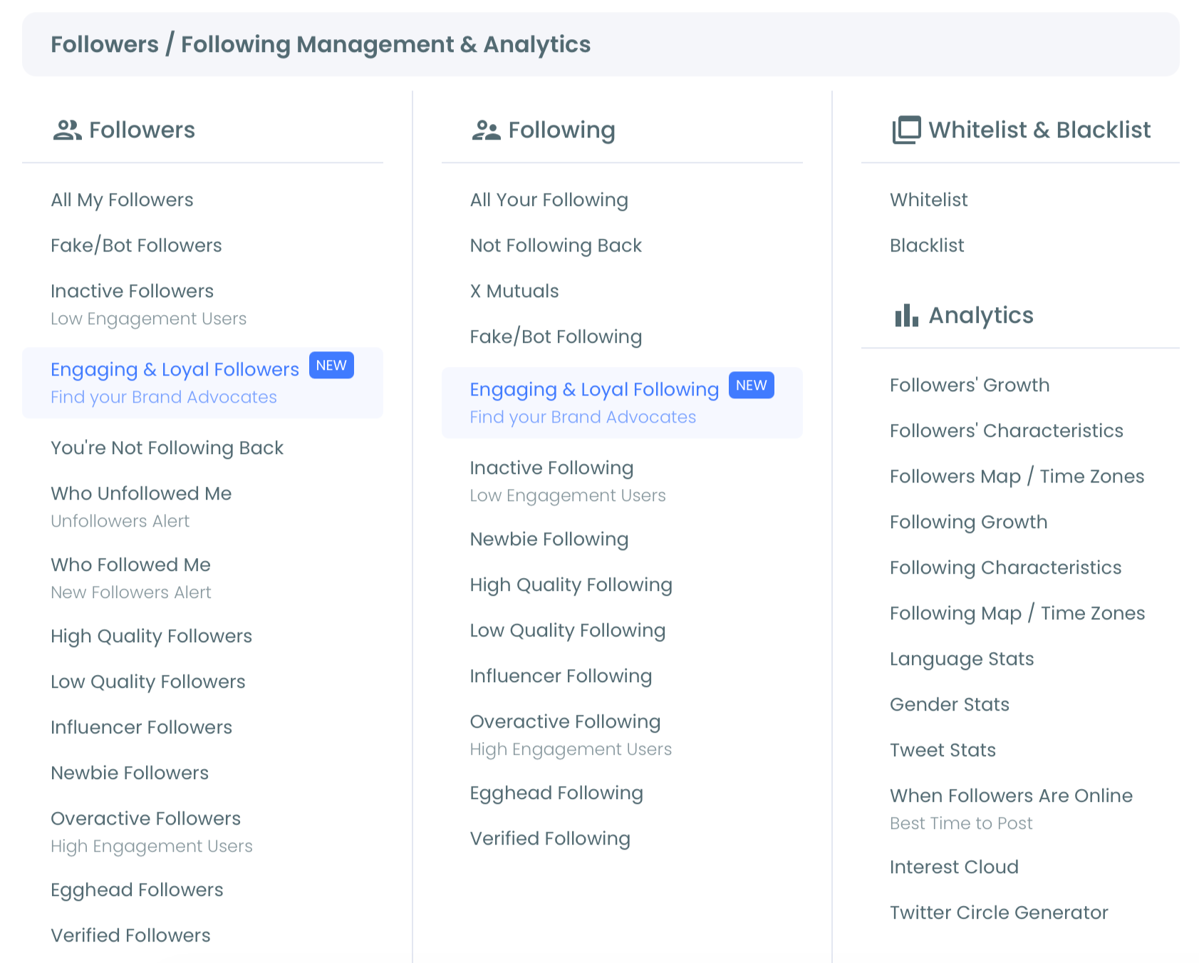
- Choose Followers' Growth from the analytics group. Collection starts at the moment of connection, so the chart fills out over the following days rather than appearing complete.
Read one week at a time
- Open the Daily Change tab. The bar chart is titled "Daily Change in Followers," with bars above zero for days you finished up and bars below zero for days you finished down. Count the two, and you have your weekly direction before you have done any arithmetic.
- Drag the timeline selector below the chart to exactly seven days. A tight window is what makes weekday patterns visible, and those patterns are invisible in a monthly view.
- Note the date of the largest negative bar and run the attribution test against it. A one-off deep bar means check the platform. A repeating one means check the format.
- Switch to the Performance tab for the same window to see the running follower level, which tells you whether the week's bars added up to a slope or cancelled each other out.
- Export from the three-dot menu in the chart's top right corner if the week needs to go into a report, choosing PNG, JPG, PDF or Print.
That ordering is deliberate.
Direction is cheap to read and decides everything downstream, so it comes first. Dating the worst day before you interpret it is what stops a platform cleanup from being logged as a content failure. And exporting last, after the window is set, keeps the picture in the report identical to the picture you analysed.
One line per step, in order:
- Authorize the account, because that is when the record starts existing.
- Open Daily Change and count the days above zero against the days below it.
- Put a date on the worst day and attribute it before you react to it.
- Read Performance for the slope, then export the window you actually looked at.
What sits behind a single follower total once it is broken into dated numbers?
https://www.youtube.com/watch?v=Y3dmFXs8mL8
What the Performance chart does and does not tell you
The Performance tab plots a line and area chart titled "New Followers Gained Daily," with your follower count on the Y axis and dates on the X axis. It shows the running follower level across the window you selected.
The name is worth reading carefully, because the shape of that line is produced by gains and losses acting on the same number at once. A smooth flat stretch does not mean a quiet period; it can just as easily mean two busy forces holding each other level.
This is the limitation I under-appreciated for a long time, and it changed how I use the two tabs. I treated the level line as the primary chart and the bars as a detail view, which is backwards.
The line answers "how much," and the bars answer "which way," and "which way" is almost always the question you actually walked in with.
For monthly reporting, the pairing matters more than either chart alone. A rising level line with mostly small positive bars is durable growth.
A rising level line built on two enormous bars is something else: an event that happened to land inside your reporting period. Circleboom's rundown of the Twitter performance metrics worth tracking is a useful frame for deciding which of the two you are being asked about.
Reading both tabs against each other takes under a minute once the habit is set, and it is the difference between reporting a trend and reporting a coincidence. That pairing is the whole reason to track whether you are gaining or losing followers on Twitter (this link takes you to Circleboom, outside Medium) on a daily record rather than a monthly snapshot.
Does gaining followers always mean the account is healthy?
No, and this is the second attribution problem hiding behind the first.
Growth counts every arrival equally, and your engagement rate does not.
A week that adds a large number of dormant, automated, or low-relevance accounts lifts the count and lowers every ratio computed against it, which is why an account can look like it is winning on followers while every other number softens.
The reverse is equally true and much more unsettling to report. Removing low-value followers pushes the count down and pushes engagement rate up.
Circleboom's guide to identifying and removing low-quality followers on X treats that as a deliberate operation rather than an accident. On the growth chart it shows up as a clean negative step, and it is not one to panic about.
Because Circleboom operates as an X Enterprise developer on the platform's official directory, the chart and the named-account lists are built from the same authorized read.
When a bar goes negative on the ninth, the unfollower view for the ninth is describing the same event rather than a separately gathered second version of it, which is what makes the attribution test above worth running.
If you would rather be told than go looking, the Twitter unfollowers alert closes the notification gap X leaves open. Circleboom's write-up on monitoring new followers without checking notifications covers the other direction.
Before you dismiss the drop
The most common objection to all of this is that follower counts are a vanity metric and the trend does not deserve the attention. That is half right, and the half that is wrong is expensive.
The total is close to meaningless on its own. The trend is not.
A rising loss rate is one of the earliest signals that a content change is not landing. Unfollowing takes more deliberate effort than scrolling past, so the reasoning runs that the chart should move before a soft engagement metric softens, though that is an inference rather than something X documents.
The second objection is that the whole thing can be done by hand. It can, for about a week, until you miss two days and lose the ability to compare anything. Manual tracking also cannot give you the one thing the exercise depends on, which is a date you trust for the day the number moved.
The third is that history will still be there when you need it. It will not. Collection is what creates the record, and nothing backfills the days before you started.
Pick the week you are curious about and check your Twitter follower gains and losses (this link takes you to Circleboom, outside Medium) for it.
→ Read your daily Twitter follower trend (this link takes you to Circleboom, outside Medium)
Odds, ends and remaining questions about the record
Can I keep a growth record for more than one X account?
Yes. Each connected account carries its own daily record, so switching between them switches the chart underneath. A handle you connect later starts its own history from that date rather than inheriting anything from the account you connected first.
Do the follower and unfollower lists cover the same window as the chart?
They run from the same starting point, because both begin when the account is connected. Pick any date off the chart and the matching list covers it, but neither one can describe a day that happened before you authorized the account.
Does a sudden drop mean I did something wrong?
Not necessarily. A one-day drop with normal days on either side is far more often a platform-side removal of locked or suspended accounts than a reaction to a post. An isolated one-date drop with normal days on either side is consistent with one of X's periodic bulk removals of fake, spam, or suspended accounts, so date it before you change anything about your content.
Can I use the growth chart for a client report?
Yes, and the export is built for it. The three-dot menu on each chart offers PNG, JPG, PDF and Print, and the export captures the tab and time window currently on screen. Set the date range to the reporting period first, or the file will show a window nobody asked about.
Is any of this risky for my X account?
No. Reading follower counts is a read-only operation through official X API access, authorized with OAuth rather than a password, and analytics views take no action on your account. Nothing in this workflow follows, unfollows, blocks, or posts on your behalf.