
Media share is the percentage of an account's posts that carry media, and link share is the percentage that carry an external link. Together they describe how an account packages what it publishes on X, and they say nothing yet about how those posts performed.
What does a Twitter media benchmark measure?
It measures how often each account in a peer set attaches media and how often it adds an external link, as two separate percentages. Circleboom calculates both shares for up to 5 accounts on X from post records retrieved through official Enterprise APIs for X.
→ Twitter media benchmark
What is a Twitter media benchmark?
A Twitter media benchmark is a side-by-side reading of how much of each account's output is visual and how much of it points off the platform. It answers a planning question: are the accounts you compete with mostly showing, mostly linking, or mostly writing?
The benchmark has two numbers per account:
- Media share: the percentage of tweets that include media.
- Link share: the percentage of tweets that include an external link.
Both are counts of behaviour. A post either carried media or it did not, so the share is a fact about the sample, not an estimate of quality.
That is why the benchmark is useful to the people who fund content. An in-house social manager deciding where production hours go, or a consultant preparing a format recommendation, needs to know what direct peers do before arguing for more of anything. You can compare media share on Twitter for your own account and up to 4 rivals in one report.

How Circleboom calculates link share and media share on X
Circleboom's X Competitor Analysis & Benchmark Report retrieves up to about 3,200 recent tweets for every account in the comparison and reports the two shares in a panel called Link & Media share %. The panel sits in the report's Content Type & Format section and draws Media and Link as separate bars for each account.
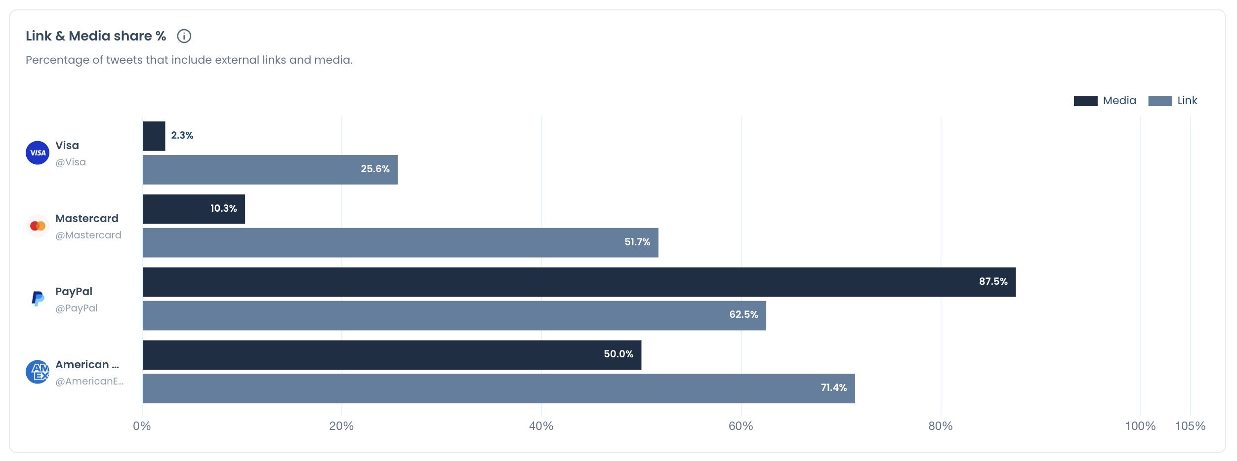
Three details about the calculation decide how far the numbers can be trusted.
The source is X itself. Circleboom is a verified Enterprise partner of X, so the posts behind each share come from official records. A scraped timeline can miss entries, and a percentage built on missing posts cannot be defended when someone asks how it was gathered.
The basis is identical for every account. One run pulls the whole set at once, on one date. Your own account, when you include it, is one more column and gets no special treatment.
The sample is recent posts, not full history. The same number of retrieved posts covers a shorter period for an account that publishes often and a longer one for an account that publishes rarely. Check the post dates before reading a small difference as meaningful.
The bars also stay put when you switch the report between its follower and following views. The switch decides whose profiles feed the audience charts, and the two bars are built from posts.
How to read the media and link bars for a Twitter account
Read each bar as a description of a choice, then check the choice against results in the neighbouring panels. The product's own reading note is short: the two shares show different ways of presenting information, they can overlap, and neither one is proof of better distribution.
A wide media gap is a visibility gap worth testing
Take the documented example: a rival attaches media to 70% of its posts and you attach media to 20% of yours.
Put that on a common scale. Across 100 posts each, the rival puts 70 visual posts into timelines and you put 20. The rival has 50 more chances per 100 posts to stop a scroll with an image or a clip.
That is a visibility gap, and it is worth a test. It is not yet a performance gap, because nothing in those two numbers says the rival's visual posts earned more response than its text posts. The honest brief is "add media to more posts and measure," not "we are losing because we are less visual."
Two shares that add up to more than 100% are overlapping posts
The bars are never summed. A single post can carry an image and a link, and it counts once in each bar.
An illustrative case shows why. Suppose an account has a media share of 80% and a link share of 60%. Added together they give 140%, which is impossible as a share of posts. Nothing is wrong with the data. The surplus over 100% is the overlap, so at least 40% of that account's posts carry both a visual and a link.
So the sum is useless as a total and useful as a clue: 80 plus 60 minus 100 gives the minimum share of posts that pair media with a link.
The reverse reading matters too. Shares of 30% and 25% add up to 55%, which does not mean 55% of posts carry something. If every link post also had an image, only 30% would. Without the post list, all you know is that the true figure lies between 30% and 55%.
Read each bar against the peer set, not against a rule
A media share means something only next to the other accounts in the set. Two illustrative sets show the difference.
In the first, four rivals sit between 55% and 75% media and your account sits at 20%. You are outside the range your category works in, and the Twitter media benchmark has found a real difference in practice.
In the second, the rivals are spread from 10% to 80%. The category has no shared habit, so your 20% is one choice among several and the share alone justifies nothing.
Peer selection decides which of those you see. Pick accounts that serve the same market in the same language at a similar size. A much larger category leader is worth studying for its approach, but its bars are not your target.
What each bar says when it is long
A long Media bar says the account invests production effort in most posts. It does not say the effort pays.
A long Link bar says the account uses X to send readers somewhere else. Its real scoreboard is on that other site, in visits the report cannot see.
Two short bars describe a text-first account. Before treating that as a weakness, look at the report's tweet type distribution, which shows how much of the account's activity is original posts and how much is replies, reposts and quotes.
Where the share stops and results begin
The share panel has two neighbours that answer the performance question. One charts how each account's posts divide across text, image, video and poll. The other shows which of those formats earned each account its highest engagement rate.
I read them in a fixed order: share first, top-performing format second, the actual leaderboard posts third. When the most-produced format is missing from the leaders, the share has pointed at wasted effort, and that is a finding too.
What a media benchmark leaves out by design
Three owner-only figures are excluded from every column of the report: profile visits, URL clicks and the video retention curve. Your own column omits them too, which keeps every row filled for every account.
The practical effect is that a media benchmark describes publishing and public response. It cannot describe traffic.
How a media benchmark run is set up for X accounts
A run needs a list of handles and one decision about scheduling. Once you log in to Circleboom Twitter, you will find the report as the first item under Monitoring.
You enter up to 5 public accounts, with or without your own, press Start Competitor Analysis, and choose a single report or a monthly series. The cost is shown in Competitor Tokens before the run begins. Tokens are counted for each rival in each report, and your own account is free.
Each finished run keeps its date. Running the same accounts again produces a new dated result and leaves the earlier one in place, which is what lets a media share be compared with itself a month later.
One caution applies to that comparison. A rerun refreshes a rolling sample, so a share can move because older posts left the window. Confirm a change in the format panels too before crediting it to a decision. That is the full setup for a link and media benchmark on X.
Do links in a tweet hurt its reach on X?
The benchmark gives no evidence either way, and it says so directly: neither the link share nor the media share establishes an algorithmic advantage. A rival with a long Link bar is not proven to be losing reach, and a rival with a short one is not proven to be gaining it.
X's API documentation gives no figure for a link penalty, so none is quoted here.
What can be said is narrower and more useful. A link post is built to earn a click, and clicks are not public. X's metrics reference for the API lists URL clicks as a non-public metric, available only to the account that owns the post. Judging a rival's link posts by likes and reposts measures them on a job they were never given.
How to judge your own link posts fairly
For your own account, score link posts on clicks and native posts on engagement. Start by finding which tweets get the most clicks, then compare those with your best posts that carry no link.
The product's guidance for this panel is practical. Link when the destination is the point of the post. If most of your posts are links and engagement is low, mix in native posts without links.
That advice does not claim links are punished. It reflects a simpler point: a feed made only of exits gives followers little to respond to on the platform.
How to make a Twitter link preview render correctly
Check the link in a card preview before the post goes out. A link post that shows a bare URL has given away the image and headline that would have made it readable in a timeline.
Circleboom's free Twitter Card Validator previews how any URL will render as a Twitter card in a tweet. It shows the card image, the title and the full tweet layout before publishing.
The preview is built from the page you link to, not from the tweet. When the card is missing its image, the fix belongs on the page, and rewriting the post text will not change the result.
A short routine keeps link posts presentable:
- Run every new landing page through the validator once.
- Recheck a page after its headline or main image changes.
- Hold the post if the card shows no image.
If cards are new to you, the post on the Twitter Card Validator is the place to begin. This step matters most for accounts with a high link share, because a broken preview repeats across a large part of everything they publish.
What to do when your media share on X is the short bar
Add visuals where they explain the subject, and prepare them in batches so the habit survives a busy week. Circleboom's page on designing Twitter posts covers building a tweet visual without a designer.
Size the image before it is scheduled. An image that does not fit the timeline's frame gets cropped, so keep a reference for social media image sizes next to your templates.
For teams preparing a batch: one upload that schedules a set of tweets with their images attached.
Video is media as well, and it has its own section in the report, with a video posting rate and total video views for each account. For retention on your own clips, which no competitor column can show, use Circleboom's video analytics for Twitter.
Then rerun the media benchmark on the same set of accounts. A media share that rose while the top-performing format stayed the same tells you the new visuals have not earned their place yet.
The takeaway on link and media share for Twitter accounts
A share tells you what an account chose to publish, and only the panels beside it tell you whether the choice worked.
Measure the choice first, with the same method for every account, and let the results decide the budget. The Twitter media benchmark gives you both on one page.
→ Open the media benchmark for your X account
What people ask about link and media share on X
Which format works best on X: text, image, video or poll?
No single format wins for every account. The report's Top-performing format panel names the format with the highest engagement rate for each compared account, and it should be read with the number of posts behind it. For background, see how different types of visual content impact engagement on social media.
What percentage of posts on X should carry media?
There is no target percentage in the benchmark. Use the range your direct peers show as a reference point, then test a higher media share on your own account and watch whether per-post results move.
Which accounts cannot be added to the comparison?
Private accounts cannot be compared, and neither can any account with more than 3,000,000 followers, including your own. The set is capped at 5 accounts per report.
Can the benchmark update itself every month?
Yes. Choosing Keep it up to date every month produces today's report and then one automatic report a month for the number of months you select. End Scheduling stops the series at any time.