
A Twitter follower graph is a time-series chart that plots your follower count on the Y-axis against dates on the X-axis, so a single number becomes a visible history you can read. X does not show you this history natively, which is why growth stays a mystery for most accounts.
What does a Twitter follower graph actually tell you that the follower number can't?
It tells you when your audience moved and by how much. Circleboom charts your X follower history as a visual Twitter follower graph using the official X API, turning a flat count into dated gains, losses, and trend lines you can correlate with real events.
→ visualize your Twitter follower growth

Your profile shows one number: current followers. That number hides everything useful. It cannot tell you whether last week was a good week, when a spike happened, or whether a slow decline started 40 days ago. A count is a snapshot. Growth is a shape, and the shape only appears on a chart.
What a Twitter follower graph is
A follower graph is a record of your follower count sampled at regular intervals and drawn as a line or bar chart over time. Each data point is a dated snapshot, and the distance between points is your net change for that period.
Three readings live inside the same data:
- The cumulative level shows your total follower count at each date, so you see the overall trajectory.
- The daily change shows net followers gained or lost each day, so you see individual events.
- The slope between points shows velocity, which tells you whether growth is accelerating or flattening.
Circleboom builds these views for you. The Performance tab draws a line and area chart of your follower level over time, and the Daily Change tab draws a bar chart where bars above zero are gain days and bars below zero are loss days. Circleboom records your X follower count at regular intervals through the official X API, so the graph reflects real platform data, not estimates.
Velocity is the reading most people miss. Two accounts can both be at plus 1,000 for the month, but one climbed steadily while the other jumped once and flattened. The steady climber has momentum you can plan around. The flat one had a moment it cannot repeat on command. A basic Twitter follower tracker captures the raw count; the value comes from reading the slope between the points, not just the points themselves.
The number tells you where you are. The graph tells you how you got there.
Why X hides your follower history
X has never offered a historical follower chart, not before the rebrand and not after it. Your profile displays the current count and nothing else. The native X Analytics dashboard adds recent trends, but the full view sits behind X Premium and typically caps the window at 28 days unless you export the data.
That gap is the whole reason third-party follower graphs exist. Before 2023, free API access let tools pull daily counts and build long histories automatically. After the API moved to paid tiers, that easy history disappeared for anyone without official access.
Here is where the data-integrity difference matters. Circleboom is an official X Enterprise Developer company and pulls full, authorized follower data through official API access, while unofficial scraping tools sell partial or unauthorized numbers. When the graph you are reading drives real decisions, the source of the data is not a footnote. A chart built on incomplete scraped counts will mislead you exactly when you most need it to be right.
How to read the shape, not just the line
Most guides stop at "the line goes up, that is good." The useful skill is diagnostic reading, where you connect the shape of the graph to the events that caused it. This is where a follower graph earns its place in your workflow.
A spike is a question, not a trophy
A sudden jump means something reached far beyond your usual audience. A reply that landed, a mention from a large account, a post that got picked up. The spike itself is not the insight. The date is. Once you have the date, you check what you posted or what happened externally that day, and you learn what to repeat.
A spike also deserves suspicion. A jump made of low-quality or automated accounts inflates your count while adding nothing to your reach. When a spike looks too clean, confirm the accounts behind it are real. A guide on how to spot AI-made fake Twitter profiles helps you tell a real audience moment from an inflated one.
A drop is often not your fault
A sharp fall in the Daily Change bars is easy to read as failure. It frequently is not. X periodically removes fake, spam, and suspended accounts in bulk, and those purges can pull your count down on a single day with nothing to do with your content. The graph lets you tell a bot purge apart from a real audience reaction, because a purge is one sharp cliff while a content-driven loss trails across several days.
A flat line can hide churn
A follower count that barely moves looks stable. The Daily Change view often reveals that it is not. Steady gains offset by steady losses produce a flat cumulative line while your audience quietly turns over underneath it. That churn is invisible on your profile and obvious on the graph, and it is the difference between an audience that is holding and one that is slowly being replaced.
Measure a campaign against its baseline
The most valuable thing a follower graph does is settle arguments about attribution. Without a history, "the campaign added 500 followers" is a claim you cannot check. With one, it is a measurement.
The method is straightforward. Before a campaign starts, read your existing trend to establish a baseline rate. After it ends, compare the post-campaign trend against that baseline. The difference, minus your normal churn, is the campaign's real contribution. A gain of 500 means very different things if your baseline was already adding 400 a month versus if it was flat.
Consider the math. If your baseline adds roughly 200 followers a month and a campaign week shows plus 500, only about 300 of those are attributable to the campaign, not the full 500. Reading the raw total without the baseline overstates the result by more than half.
A breakdown of Twitter analytics metrics and insights puts that follower delta alongside impressions and engagement, so the number is judged in context rather than in isolation.
This is also the reading that matters for monthly reviews and client reporting. A single follower count has no meaning in a report. A graph showing a consistent climb, a recovery from a drop, or the clear footprint of a specific initiative tells a story a number never can.
Video walkthrough: the follower-graph read that separated my real growth from a bot-purge dip.
How to read your Twitter follower graph in Circleboom
Here is the flow, from login to a graph you can actually interpret.
Connect your account and open the growth view
- Log in to Circleboom Twitter and connect your X account with official OAuth.
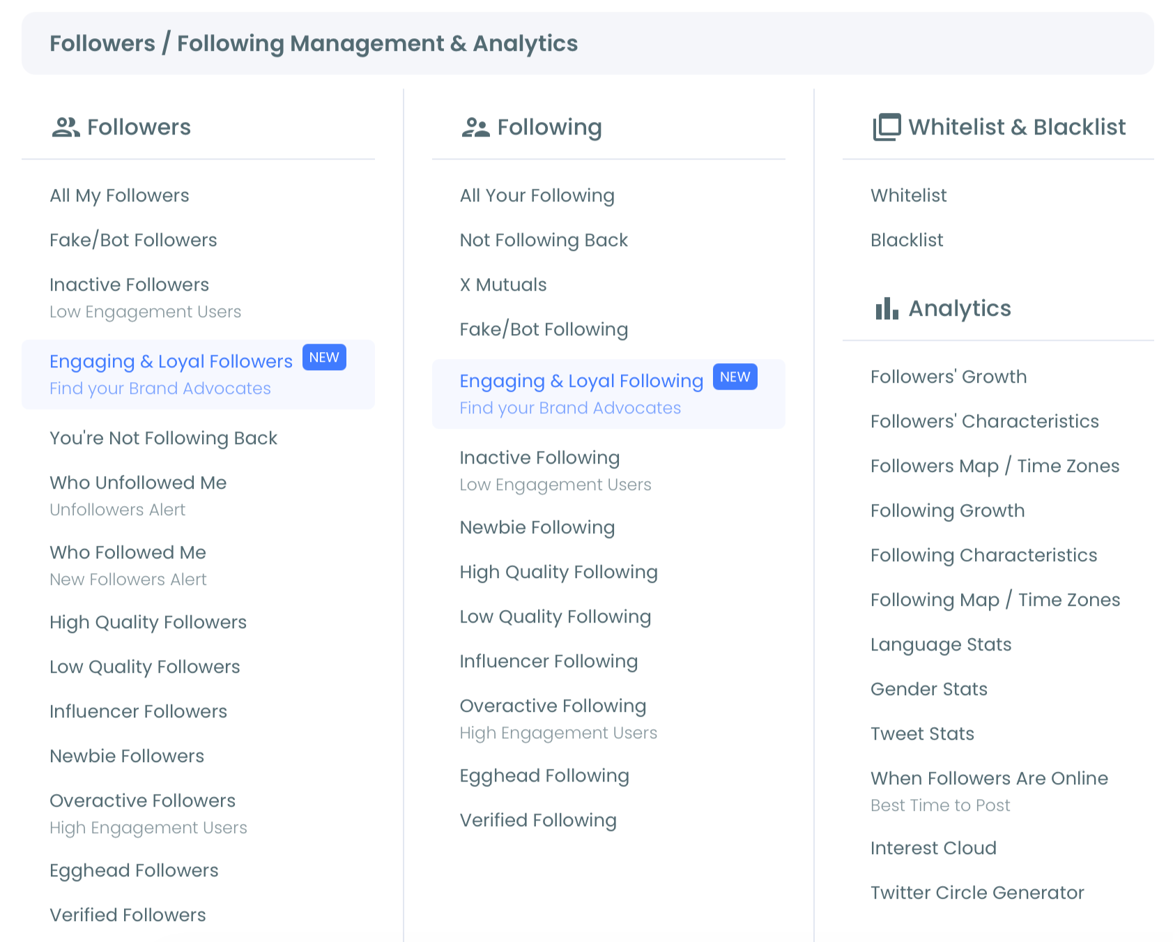
- Open the Follower and Following management and analytics menu, then select the Followers' Growth view where your Twitter follower graph is drawn.
Switch views and narrow the window
- Select the Performance tab to see your cumulative follower level and the overall trajectory across the full connected period.
- Switch to the Daily Change tab to read individual gain and loss days as bars, which is where events show up clearly.
- Drag the timeline selector below the chart to zoom into a campaign week, a viral post window, or a suspected purge, so the shape you are reading matches the question you are asking.
- Export the current chart as PNG, JPG, or PDF from the three-dot menu when you need it for a report or a client update.
That order works because each step narrows what you are looking at before you draw a conclusion. The Performance view frames the trend, the Daily Change view isolates the event, and the timeline selector removes the noise around it. Read them out of order and a single purge day can make a healthy month look like a collapse.
At a glance: connect, open the growth view, switch tabs, narrow the window, export. The Twitter follower growth stats view handles the data collection so you only handle the reading.
Turn the graph into decisions
A graph you only look at is a wall poster. A graph you act on is a tool. The point of visualizing growth is to change what you do next, and follower movement is only one input among several.
Pair the timing on your follower graph with the accounts behind it. When you spot a spike, cross-check the new accounts to judge whether the growth was relevant or low quality. For that deeper read, the full Twitter Follower Stats view describes how many and how fast, moving past the single number your profile shows.
When you spot a drop, the question shifts to who left. Reading the composition of the loss tells you whether a real segment walked away or a batch of dormant accounts was cleaned out. The Twitter Follower Analysis view answers that by describing who your followers are, not just how many remain after the dip.
Growth timing feeds content decisions too. Once the graph shows which weeks pulled real followers, a guide on how to get more followers with Twitter analytics turns that pattern into a repeatable content plan instead of a one-off. The graph is the timing layer, and quality and content are the layers you stack on top of it.
The bottom line
A follower count answers "how many." A Twitter follower graph answers "when, how much, and why," and only the second question changes your strategy. Circleboom draws that graph from official X data, gives you both a cumulative trend and a daily-change view, and lets you zoom into any window so a single purge day never gets mistaken for a trend. Read the shape, correlate the dates, and your next post stops being a guess.
→ start tracking your Twitter follower graph
Questions about reading a Twitter follower graph
Can I see my follower count from a specific past date?
Yes, within the range Circleboom has collected. History begins the day you connect your account, and every day after that is stored as a dated point, so you can read your count on any day since connection. Counts from before you connected are not retroactively available.
Why did my follower graph drop on a day I posted nothing?
That pattern usually points to a platform-wide cleanup. X removes fake, spam, and suspended accounts in bulk, and those removals appear as a sharp single-day cliff on the Daily Change bars rather than a gradual slide. A content-driven loss tends to spread across several days instead.
Is the follower data accurate?
The data comes from the official X API and reflects real changes in your follower count, because Circleboom accesses it through authorized channels rather than scraping. Accuracy is bounded only by what the official API reports at each collection point.
How is a follower graph different from the number on my profile?
Your profile shows one current number with no history. A follower graph shows that number sampled over time, so you can see trajectory, velocity, and individual gain or loss events. The graph is the difference between knowing where you are and understanding how you got there.
How often should I check my follower graph?
For diagnosis, check it whenever something notable happens, such as a launch, a viral post, or an unexpected drop, and use a short timeline window to isolate that event. For strategy, a monthly read of the longer trend is enough to tell whether your growth is durable or one-off. Short windows explain events; long windows explain direction.