
In the sample report Circleboom documents, the account that invested most in media and video also posted the lowest engagement rate of the four accounts compared. Nothing on its profile page hinted at that result.
A Twitter engagement rate benchmark built from named rivals is how you catch a gap like that in your own category, and it takes one comparison to set up.
How do you compare your Twitter engagement rate with your rivals'?
Put your account and theirs in one dated comparison and read every rate on the same basis. Circleboom calculates the engagement rate of up to five X accounts as engagement divided by impressions through official X (Twitter) Enterprise APIs.
→ Twitter engagement rate benchmark
Why one Twitter engagement rate cannot tell you where you stand
Your own analytics describe you and nobody else. X's own activity dashboards let an account owner track each post's impressions and engagements, along with the engagement rate it earned. They are the right place to study your own posts, and they have no column for a rival.
That leaves most people comparing by hand. They count a competitor's likes for a week, guess at the views, and set the result beside their own figure. Each number was gathered differently, so the comparison falls apart the moment someone asks how it was made.
The mistake I see most often is treating the rate as a verdict. A low rate has several possible causes:
- A diluted audience.
- Output that dropped.
- A format that does not suit the topic.
- Posts that did not land.
Each cause has a different remedy, and one figure cannot tell them apart.
Screen demo: checking your own tweet stats before you set them beside a rival's.
Why published averages disagree with each other
Search for a Twitter engagement rate benchmark and you will find tables that contradict one another. The reason is the formula. Some sources divide engagements by followers and others by impressions, and few say which one their table used.
A figure divided by followers and a figure divided by impressions are not the same measurement. Setting your rate against a table without knowing its basis tells you nothing, and no published table names the accounts you compete with.
What a hand-built comparison leaves out
A profile page shows follower count, following count and recent posts. It shows no active-follower share and no per-post averages, and it gives no rate on a stated basis.
Circleboom fills that gap on X by retrieving the same fields for every account in one run. You can compare your X engagement rate with rivals on one date instead of stitching together figures from different weeks.
What the X benchmark report measures for every account
The X Competitor Analysis & Benchmark Report places up to five accounts side by side and shows each one's engagement rate in three places:
- The essentials table, in a column labeled ENGAGEMENT RATE.
- The Engagement summary table, in a column labeled ENGAGEMENT RATE %, beside average likes, reposts, replies, quotes and bookmarks per post.
- The Engagement Rate Over Time chart, month by month for every account.
The basis is total engagement divided by total impressions. The rate describes how often people who were shown a post interacted with it. It is not a share of followers, and it should never be quoted as one.
The essentials figure is a summary for scanning the row. The Engagement section carries the calculated rate next to its inputs, so read the two together and quote the second.
Circleboom is one of the companies on X's official Enterprise developers list, which is why the report can draw on the same official records for your rivals as for you. For a manager or a client, that means a figure with a named source and a date.
Why the report sticks to public metrics
X's API documentation separates public metrics from non-public metrics. Likes, reposts, replies, quotes, bookmarks and impressions are public. URL clicks and profile clicks are available only to the account that owns the post.
The report follows that line on purpose. Owner-only metrics are left out of every column, including yours, so no rival's row has blank cells. A Twitter engagement rate benchmark is fair only when each account is measured with the same inputs.
What the monthly chart adds to the table
The summary table gives each account one rate for the analyzed sample. The chart shows whether that gap is steady or comes and goes. A rival who leads you every month is a different case from one who led in a single month.
Check coverage before you compare bars. The report reads up to about 3,200 recent posts per account, so a frequent publisher's sample spans fewer months than an occasional publisher's.
The rate is one part of a wider read. Audience and content sections sit in the same report, and the broader method of competitor analysis on Twitter is worth knowing before you act on a single column.
Which X accounts are fair to compare your rate with?
Fair peers are direct peers: accounts doing the same job as yours, for the same audience, at a similar size. Choose them before you look at any number, because the peer set defines what "higher" and "lower" will mean.
Use this checklist for each candidate:
- Market. Does the account sell to, or write for, the same audience you do?
- Language. Does it publish in the language your audience reads?
- Scale. Is its follower count within reach of yours, not ten times larger?
- Purpose. Does it publish original content, or mostly answer customers?
- Business model. Does it earn from the audience the way you do?
The purpose check catches more errors than the others. An account that runs almost entirely on replies is a support desk, and its engagement profile describes customer service. Setting your content against it is a category error.
Keep category leaders in their own set
A far bigger account is a reference, not a peer. It is useful for studying approaches and misleading as a target, because its totals reflect resources you may not have. State which kind of set you built, and do not mix the two.
Two hard limits apply. Only public accounts can be analyzed, and an account with more than 3,000,000 followers cannot be added. If you are still deciding who belongs, it helps to start by analyzing each competitor's Twitter account before you fix the set.
Freeze the set once you choose it. If you swap an account later, say so in your notes. A different group is not a change in your position.
How to compare your Twitter engagement rate benchmark with rivals
Seven steps, grouped into three short phases.
Enter the peer set you chose
- Open Circleboom Twitter Management and make sure your X account is connected.

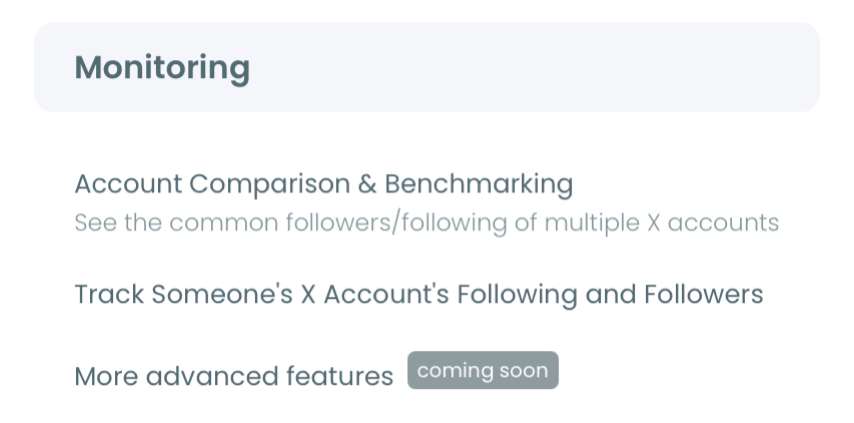
- Find the Monitoring menu and pick X Competitor Analysis & Benchmark Report inside it.
- Give every handle a separate @ field below the Account Handles label. Use the first slot for your account and the + button to add competitors, up to five accounts in total.
Start the run and put it on a schedule
- Select Start Competitor Analysis. The cost is shown in Competitor Tokens before the run begins.
- Choose Keep it up to date every month if you plan to track the gap. Set how many months it should run and the day of the month for the first monthly report. Choose Just this once for a single reading.
Read the rate beside its context
- Compare the engagement rate column in the essentials table across the row, and note three neighbors for each account:
- Followers.
- Active followers.
- Average impressions.
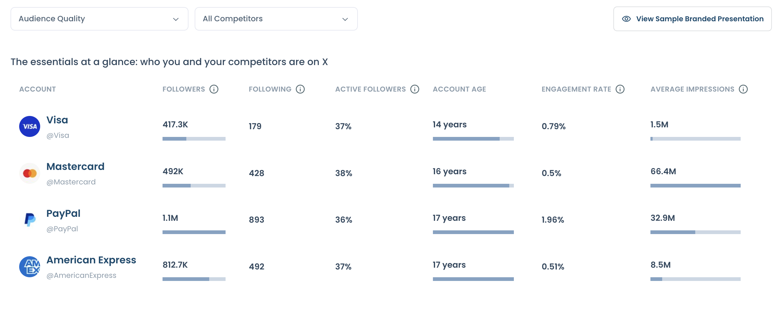
- Open the Engagement section and record the rate from the summary table for each account, then view the Engagement Rate % tab on the over-time chart.
Choosing the set before the run keeps your Twitter engagement rate benchmark honest, and scheduling it at the start means the second reading arrives without anyone having to remember it. Reading the rate next to active followers and impressions is what turns a ranking into a lead on the cause.
How to check on Twitter whether the gap is closing after a change
Compare two dated runs of the same saved set, and read them in a fixed order. A second run is the only way to know whether a change moved your rate or the whole category moved.
Each run is saved under Your saved analysis with its date. Pressing Get a new report with the latest X data pulls fresh data for the same handles and produces a new dated result. The earlier run is not overwritten. It stays under Past Analyses.
A monthly schedule removes the remembering. With Keep it up to date every month selected, a 12-month schedule produces 13 reports: one with today's data and one for each month after. You can stop it at any point with End Scheduling.
A re-run checklist that keeps two readings comparable
Work through these checks before you claim progress:
- Confirm the handle set is identical in both runs.
- Compare per-post averages first, then monthly totals.
- Read audience composition last, to see whether the audience changed.
- Check which months of posts each run covers.
- Confirm the direction in more than one section.
Totals move with post count, which is why per-post averages come first. The arithmetic shows it: 30,000 engagements from 300 posts and 10,000 engagements from 100 posts are both 100 per post. What separates those two accounts is volume.
Why a moved number is not yet proof
A re-run refreshes a rolling sample. A changed average can reflect new posts, older posts leaving the sample, or extra interactions on posts that stayed in it. Treat a moved rate as a signal to confirm, and state it at that strength when you report it.
Check active followers on X before blaming your posts for a lower rate
A lower rate is sometimes an audience problem, and the report tells you whether to suspect it. A Twitter engagement rate benchmark that stops at the rate column misses this cause. Compare your active followers share with each rival's before you judge your posts.
The Audience Quality section explains why this matters. Each new post is first shown to a small sample of the account's own followers, and their early response decides whether X widens its reach. A follower base with many dormant accounts makes that opening round harder to pass, even when the post is good.
Raw follower counts hide this. Take a competitor with 50,000 followers of whom 40% are inactive. That is about 30,000 active followers. Your 35,000 followers at 85% active come to about 29,750, so the two accounts are nearly even on active audience.
Protect useful contacts before any removal
If your active share trails the set, review your inactive followers before you remove anyone. Inactive here means an account that rarely posts. Some of those people still read what you publish, and removing them is no promise of wider reach.
When you do decide to remove Twitter followers who don't engage, keep useful contacts on a protected list and select the rest deliberately.
In Circleboom, the action to remove X followers is handled by the Chrome extension, since X's API has no method for it. Nothing is removed until you confirm your selection, and the batch is processed gradually.
When the audience matches and the rate still trails
If your active share is level with your peers, look at the posts. Circleboom's engagement analytics view ranks your own posts by rate, so you can see which ones were shown widely and drew little response.
For ideas on the content side, these tips for brands to get better engagement on Twitter are a starting list. Test one change at a time so the next run can show its effect.
Which fix to start with on Twitter, based on what the report shows
A Twitter engagement rate benchmark is only useful if it ends in one next move. The report will show you several gaps at once, and working on all of them hides which change helped. I pick a single branch and leave the others for the following run:
- If your rate is lower and your active share is lower too, review your audience first.
- If your rate is lower and your active share is level, study your posts and the rivals' top five.
- If your rate is higher but your average impressions are lower, work on timing and posting cadence.
- If every account's rate moved together, hold your course and report it as a category shift.
- If you are ahead on both, schedule the monthly run and protect what works.
Whichever branch fits, keep the peer set frozen and let the dated runs do the arguing. Two runs give you a direction, and a year of them gives you a record of your category that a published engagement rate benchmark cannot match.
→ Start your rival engagement rate benchmark on Twitter
Questions that come up after the first rate comparison
Is the rate worked out against followers or against impressions?
Against impressions. The rate in Circleboom's X competitor report is total engagement divided by total impressions, and the chart states that basis. If you arrived with a figure divided by followers, it is a different calculation and will not match.
Can't I just run each account through a free engagement rate calculator?
You can for a quick read of one account. Circleboom's free tweet engagement calculator works from a public account's last 100 posts. It does not place several accounts in one dated comparison or keep earlier runs for the same set.
How many tokens does a monthly comparison cost?
Circleboom charges one Competitor Token for each competitor in each report, while your own account is never charged a token. Put 5 competitors into one report and you spend 5 tokens. Keep those 5 competitors on a 12-month schedule and the total reaches 65 tokens, since 13 reports come out of that schedule.
Can I share the rate comparison with a client or a manager?
Yes. Create Branded Presentation builds a logo-carrying export from the current report, which suits client reviews and monthly reporting decks. Keep the X account set and the run date visible in it, so the Circleboom figures can be read in context.