
Quote a sponsored tweet from your follower count and one of two things goes wrong. You overcharge on an audience that cannot respond, or you undercharge on reach you never measured.
Either way, the brand finds out when the tweet's numbers arrive. A rate worked out from your own X data avoids both mistakes, and it fits on one page.
Guessing from follower count: a price nobody can check, built on a number that keeps dormant and suspected fake accounts. Circleboom: Circleboom reports your average impressions per tweet, 90-day engagement rate and audience quality on X through official Enterprise APIs, with a date on every figure.
→ sponsored tweet rates
The steps below end in a one-page rate sheet you can send.
What a sponsored tweet rate on Twitter has to prove
A sponsored tweet rate has to prove that the tweet will be shown to real people who tend to react. That is a narrower claim than "I have a large account," and it is the only one a brand can test afterward.
Most free calculators skip the proof. They take a follower count, or figures you type in yourself, and return a price. None of them asks whether the figures are real, which window they cover, or how many posts sit behind an average.
The mistake I see most often is treating sponsored tweet rates as something to look up. There is no public price list to look up. The number is agreed between you and one brand, so the strength of your evidence decides how the conversation goes.
Honest numbers are also the safer ones. The FTC's Endorsement Guides Q&A calls likes from non-existent people clearly deceptive. That is a good reason to keep padded signals out of a sales document.
So working out a sponsored tweet rate is a narrow job: collect three figures from your own account, check the sample under them, and put them on a page. You can work out your own sponsored tweet rate in Circleboom as you read.
What you need in hand before pricing a tweet on X
You need three things in hand before you price anything:
- The X account you are pricing, connected to Circleboom.
- Recent posts on that account, since the engagement figures average the last 90 days.
- The brand's brief, so you know which market and language it cares about.
The tool for the first two is Circleboom's X Account Analysis. With it, you can read your own X account in a dated, nine-section report that covers audience quality, demographics, posting behavior, engagement and impressions.
Circleboom is a verified Enterprise partner of X, and that has a direct use in a rate conversation. When a brand asks where your figures come from, the answer is official X records with a retrieval date, not a screenshot.
Compared with a calculator that prices whatever count you type in, the report reads the account itself. That is the difference between an opinion and a basis for pricing a sponsored tweet on X.
What the follower count cannot tell you about fit, response or reach
The follower count leaves three things open, and each gets one line here.
Audience location and language decide fit with the brand's market, and follower demographics on Twitter covers that side in depth.
Whether your engagement rate is good enough depends on its basis: the report divides total engagement by total impressions, not by followers, so compare it only with rates built the same way.
And no fixed share of followers sees any one tweet. X shows a new tweet to a small group first, which is why the guide prices on average impressions and never on the count.
How to work out sponsored tweet rates from your X data, step by step
The process, in the order the figures depend on each other.
Run a dated analysis of the account you are pricing
- Open Circleboom Twitter and sign in with the X account you are pricing. There is no field for a handle: the page opens on the account you signed in with.

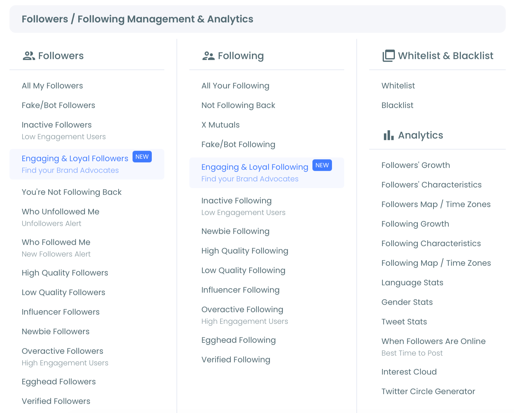
- Go to the Followers / Following Management & Analytics menu then open Account Analysis, listed first under Analytics.
- Select Start Account Analyses, then pick a schedule. Just this once gives a single analysis with today's data. Keep it up to date every month adds 12 automatic monthly analyses, 13 in total, on a day of the month you choose.
Collect the figures for the rate sheet
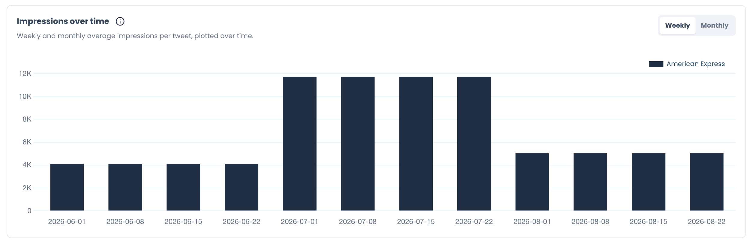
- Copy average impressions from the essentials row, then open Impression/Views and set Impressions over time to Weekly. Check whether the weekly bars sit near the average or swing far from it.
- Copy the engagement rate from the Engagement summary, not from the essentials row. The summary states its window: per-tweet averages over the last 90 days of activity. Write "last 90 days" next to the figure.
Review the sample before you quote any average
- Count the rows in Top 5 Tweets by Engagements, under Content leaderboards. When the analyzed window holds fewer than five posts, the list shows fewer rows.
- Select Create Your Presentation to build a branded export of the report, and keep the analysis date visible on it.
The sequence works for a plain reason. The analysis fixes one date for every figure, and the two averages are copied from the sections that state their windows. The row count then tells you how much weight those averages can carry before a sponsor sees them.
The same flow, compressed:
- Analysis first, so every figure shares a date.
- Impressions average, checked against the weekly bars.
- Engagement rate from the 90-day summary.
- Post count before anything is quoted.
On screen: Twitter analytics read without X Premium, the same kind of account data this rate sheet is filled from.
Why the post count comes before any average on X
A per-post average can stand on a handful of posts, and the report tells you when it does. Step 6 exists for that one check.
Here is the behavior to know. The Engagement summary averages your last 90 days of activity. If you posted four times in those 90 days, every per-tweet average in that run describes four tweets.
The leaderboard makes this visible. It is titled Top 5, but it lists only as many tweets as the window holds. Three rows means three posts.
Count the leaderboard rows before you quote an average, because an average of three tweets is a description of three tweets, not a forecast.
One post can also carry most of the total. When the top row holds far more engagements than the rest, the average is mostly that tweet.
What you do with the count depends on what it shows:
- Five rows with similar engagement: quote the averages as they are.
- Five rows with one far ahead: quote the average and name the outlier.
- Fewer than five rows: state the post count beside every average.
A sponsor who learns the sample size from you trusts the sheet. A sponsor who works it out later trusts nothing on it.
What goes on the one-page rate sheet
The rate sheet holds five lines, and each one names its source and its window.
| Line on the sheet | Where you read it | What to write beside it |
|---|---|---|
| Average impressions per tweet | Essentials row, checked in Impression/Views | "Average across the analyzed sample" |
| Engagement rate | Engagement summary | "Total engagement divided by total impressions, last 90 days" |
| Posts behind the averages | Content leaderboards row count | The number of posts, if fewer than five |
| Audience quality | Audience Quality, Followers view | Suspected fake or bot share and inactive share |
| Analysis date | Your saved analyses | The date the data was retrieved |
The price itself is one more line under the table. Take your impressions average in thousands and multiply it by what you ask for each thousand displays. That asking amount is your decision, and X publishes no figure I can hand you for it.
How to word the audience quality line
The audience quality line is the one most often overstated, in both directions. Both shares on it are classifications, and the wording should say so.
Keep "suspected" in front of fake or bot, because the label flags an account for a closer look and proves nothing about it. "Inactive" describes accounts that rarely post, and a quiet account may still be reading.
Write the percentage and the account count together, and name the view. The audience panels have a Followers and a Following toggle, and a sponsored tweet rate describes the Followers side only.
Pricing from the weaker weeks
When the weekly bars swing widely, price from the lower weeks. An average pulled up by one strong week promises more than a normal week delivers.
As an illustration only: if most weeks show about 3,000 impressions per tweet and one week shows 9,000, the sheet should use 3,000. The strong week is a bonus for the sponsor, not a promise from you.
This is how sponsored tweet rates stay defensible after the tweet runs.
Two comparisons a brand may raise
A brand may set your price beside what an ad on X would cost it. That is the brand's side of the math, and the background sits under why Twitter ads are so expensive.
You may wonder in turn whether X already pays you for the same impressions. Creator payouts are a separate income route, and a Twitter ad revenue calculator is the place for that question. Keep it off the sponsor's sheet.
Finding brands, pitching them and any follower cleanup before a pitch are different jobs from setting the number, so this guide leaves them out.
How to prove delivery after the sponsored tweet is live on Twitter
Prove delivery with the sponsored tweet's own numbers and its link clicks, reported against the averages you quoted. The quote was built on averages, so the proof has to be the one tweet set beside them.
One tweet cannot be read from an account summary. Open the sponsored tweet in engagement analytics on Twitter, where tweet-level figures are shown in full and can be sorted.
Report it in the same terms as the rate sheet:
- Impressions on the tweet, next to your quoted average.
- Engagements on the tweet, by type.
- Engagement rate against impressions, next to your 90-day figure.
Link clicks are a separate line
If the tweet carried the brand's link, clicks get their own line. A like and a click are different events, and X's own help for activity dashboards lists link clicks as clicks on a URL in the tweet.
Agree with the brand before posting which click count is the record. The setup for the tweet side is covered under track link clicks on X.
When the sponsor wants a file and not a message, you can export Twitter analytics and attach it.
If the tweet lands below your average, say so first. An honest shortfall with a dated report behind it keeps the next booking alive.
When to re-price your sponsored tweets on X
Re-price only from a new analysis, read next to the earlier one in Compare Reports. A feeling that the account is doing better is not a reason to change a number a sponsor has already seen.
Compare Reports adds up to four of your past analyses beside the current one, so five fit on one screen. The monthly plan fills that history on its own schedule.
A changed figure needs one check before it changes your price. Each new analysis reads a rolling sample, so a number can move for three reasons:
- You published new tweets.
- Older tweets left the sample.
- Retained tweets picked up more interactions.
Raise the rate when the per-tweet averages rose on a comparable post count, not when a monthly total grew. Totals grow when you post more. A sponsor buys one tweet.
Take a baseline before a big change
A baseline makes the comparison cleaner. Take an analysis before a major change, such as a new content plan or a follower cleanup, and another about 30 days later. Sponsored tweet rates that move after that pair of reports have a before and an after to point to.
Two practical notes. A skipped month stays missing from the history, since each analysis is a record of its own date. And earlier analyses are never overwritten, so the sheet you sent last quarter can always be matched to its report.
For the wider work of raising what each tweet is worth between analyses, see how to measure, increase and monetize tweet value.
Your X rate sheet checklist before you send it
Run through these five checks, then send the sheet:
- The analysis date is on the page.
- The engagement rate comes from the 90-day summary and says so.
- The impressions average was checked against the weekly bars.
- The post count is stated if the leaderboard shows fewer than five rows.
- The follower count is listed as context, never as the basis of the price.
I would add one habit on top of the checklist. Keep the sheet and the report it came from together, so a question six weeks later takes a minute to answer.
Sponsored tweet rates built this way need little defending. The sponsor can read the page and check it.
→ Run the analysis behind your sponsored tweet rate
Still wondering what your rate should rest on?
How much should I charge for a sponsored tweet with 10,000 followers on a niche Twitter account?
The follower tier does not set the figure; your average impressions per tweet and your 90-day engagement rate do. With Circleboom's X Account Analysis, you can read both for your Twitter account and multiply the impressions average by your own per-thousand amount. A niche audience improves fit, which helps you hold that amount with a brand in the same niche.
Can I cancel the monthly plan without losing the reports behind my rate?
Yes. Cancel plan is available on an active monthly plan, and the reports you already have stay in your account. No further automatic analysis runs after you cancel, so take a new one yourself before you next change a price.