

The common belief is that styled tweet text, bold headlines, italic phrases, fancy fonts, sits behind X Premium. That belief is why most free accounts post in identical plain text forever, scrolling past bolded or stylized posts and assuming they paid for the privilege.
That belief is also wrong. The bold and italic look in other people's tweets is rarely a Premium feature at all. It is a Unicode trick, and any account can use it.
Circleboom's Font Styler, built into the X Post Planner, converts selected words into Unicode-based bold, italic, script, fraktur, and other visual styles directly inside the post editor, no X Premium required.
→ add stylized fonts to your Twitter posts
Here is how to style the right words without overdoing it.
Why everyone assumes styled text requires Premium
X's free composer gives you exactly one text format: plain Latin characters, no bold, no italic, no visual hierarchy. The platform's own paid tier expands the character limit and adds some native formatting for long posts, which reinforces the idea that any styled text on X must have come from a paid account.
That assumption misses what is actually happening under the hood. The bold or italic-looking text you see in tweets from free accounts is not native formatting at all, it is a substitution of standard Latin letters for visually similar Unicode characters from other character sets. X renders those characters exactly as typed, the same as any emoji, because as far as the platform is concerned they are just characters, not formatting. The mechanics behind this workaround have nothing to do with subscription tier.
The cost of not knowing this is a feed full of plain text where it did not have to be. A key statistic, a call to action, or the one phrase that matters most in a post gets the same visual weight as every filler word around it, simply because nobody told the account it could be different.
Which words actually deserve styling
Font Styler works by contrast, and contrast only exists when most of the post stays plain. A few rules decide what is worth styling and what should stay untouched.
- The single takeaway you want a scrolling reader to catch. If the post has one idea that matters most, that is the candidate for styling, not the whole sentence around it.
- A number or statistic that proves the point. A bolded figure draws the eye faster than the same number sitting in plain text among other digits and words.
- A short call to action. "Reply below," "Link in bio," or a similarly brief instruction stands out more when it is visually distinct from the explanation around it.
- Never the entire post. Styling every word removes the exact contrast that made styling useful in the first place.
One or two styled elements per post is the practical ceiling. Past that point, nothing in the post reads as emphasized anymore because everything does.
How to add stylized fonts to your Twitter posts
Because Circleboom is an official X Enterprise Developer, every post composed in the editor, styled text included, publishes or schedules through sanctioned API access exactly the same way a plain text tweet does.
1. Open the Post Editor and activate Font Styler: In X Post Planner, click into the Post Editor and click the font styler icon (T) in the toolbar. This opens the Font Styler toolbar inline above the editor, ready to apply to whatever text you select next.
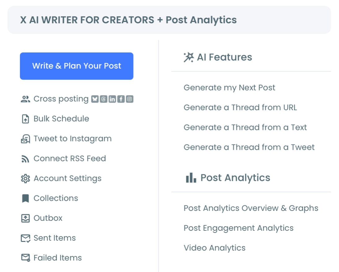
2. Select the phrase you want to style: Highlight the specific word or short phrase that needs emphasis, the key takeaway, a number, or your call to action. Selecting text activates the inline formatting options in the toolbar.
3. Apply formatting or choose a Unicode style: Use the inline buttons, Bold, Italic, Underline, Strikethrough, Superscript, Subscript, or Code, for quick formatting, or open the font style dropdown for one of eleven Unicode styles: Normal Text, Fullwidth Text, Fraktur, Fraktur Bold, Double Struck, Cursive Script, Circled, Circled Inverse, Squared, Squared Inverse, or Inverted. The styled text updates instantly in the editor.
4. Review and publish or schedule: Check how the styled phrase reads against the plain text around it, then use Queue Up Next, Post Now, or Schedule to publish the post exactly as it appears in the editor.
That order matters because the emphasis decision comes before the format decision. Picking the phrase first keeps the styling deliberate instead of decorative, which is the entire difference between a post that draws the eye and one that just looks busy.
What styled text changes in a plain-text feed
A feed made up almost entirely of plain text is visually uniform, every post looks like every other post until a reader actually stops to read the words. A single styled phrase breaks that uniformity immediately, giving the eye something to land on before the reader has decided whether to keep scrolling.
This matters most for accounts that post analysis, opinions, or frameworks without attaching images to every tweet. Clear text formatting becomes the only available tool for visual hierarchy when there is no media to lean on, and a bolded key term or styled CTA does the work an image would otherwise do.
The same logic extends to thread openers specifically. A styled headline phrase at the start of a thread gives a scrolling reader a reason to stop and read the rest, where a plain opening line blends into everything around it.
X never advertises the workaround, so most accounts assume it doesn't exist
The reason most people think styled text requires payment is that X has no native UI element that explains otherwise. There is no menu that says "style your text without Premium using Unicode." The workaround exists entirely outside the platform's own interface, which means the only way to discover it is to already know it is possible.
Changing fonts on Twitter posts without X Premium is one of several cases where a platform limitation trains an entire userbase to accept a paywall that does not actually exist for the specific thing they want. The same pattern shows up anywhere a feature looks locked behind a subscription but is actually just unadvertised.
The mistake to avoid
The most common mistake with Font Styler is applying it to an entire tweet instead of a single phrase. A fully styled post looks busy, often harder to read at a glance, and creates zero contrast since nothing in it is plain anymore. Pick the one phrase that matters and leave the rest of the post untouched.
The second mistake is styling a keyword that needs to be searchable. Because styled characters are Unicode symbols rather than standard letters, X's search does not recognize them as the words they visually resemble. A styled brand name, hashtag-adjacent term, or product keyword becomes invisible to anyone searching for that exact word in plain text. Keep anything that needs to be findable in standard characters, and reserve styling for emphasis words that do not carry a search function.
Common questions
Do I need X Premium to use Font Styler?
No. Font Styler works through Unicode character substitution inside the X Post Planner editor, with no Premium subscription or additional setup required. This is the same mechanism behind most styled text you see from free accounts elsewhere on the platform.
Are these actual fonts?
No. They are Unicode-based character sets that visually resemble bold, italic, script, or other styles, not real typography or font files. X's interface renders them exactly as typed, which is what creates the styled appearance without any platform-side formatting support.
Will styled text hurt accessibility or readability?
It can if overused. Screen readers may announce Unicode symbol characters by their technical names rather than the letters they resemble, and excessive styling reduces readability for any reader. Formatting text thoughtfully means reserving styled characters for short emphasis phrases, not full sentences or paragraphs.
Can I combine multiple formatting options on the same phrase?
Yes. Inline formatting like bold or italic can be combined with a Unicode font style on the same selected text, letting you stack effects for a single phrase that needs maximum visual weight. Use this combination sparingly, since it concentrates even more contrast onto one already-emphasized element.
Your next move
Plain text is not a limitation you have to accept, and styled text is not a feature you have to pay for. Pick the one phrase in your next post that actually deserves attention, style it, and leave everything else exactly as it was. Select it, style it, publish it.


)